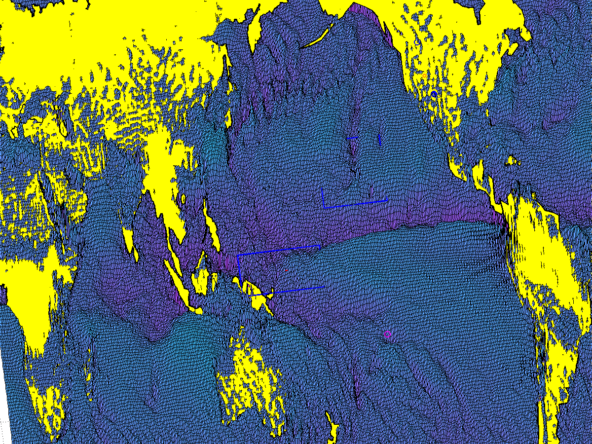
Why does moisture seem to travel through our planet’s atmosphere with such a mind of its own? In this example for full-thickness atmospheric moisture for the month of October, 1989, the north-south aligned furrows and ridges (high precipitation and high evaporation respectively) appear to have little relation to the velocity patters of the full atmosphere which include both dry and moist air. For example, here is the related full thickness atmospheric velocity overlay as captured by a few streamlines:
To me there is a tangible aspect to these surface plots that is impossible to capture any other way, but it may take some getting used to. As I often apply for content at this site, the deeper and darker zones represent the greatest intensities of atmospheric precipitation for the full atmosphere. As a surface plot of a scalar field for the selected view, I’ve tried to squeeze in 2D streamlines of the ERAI full atmosphere wind velocities. The origin of each streamline I’ve launched into the vector field is represented by an asterisk (star) symbol. The dark blue lines all originate from near the Greenwich meridian to the west of the cropped image, and the magenta lines all originate from a common meridian to the east. Many streamlines often appear to be ‘submerged’ but in this case, that is wherever the evaporation is relatively high (lighter blue and higher surface). Other annotations are related to ongoing work.
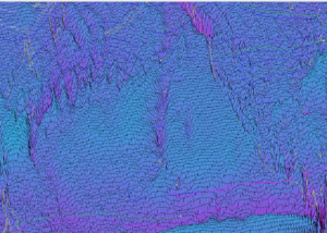
I’m adding another cropped excerpt for the western side of this map below. This gives me a chance to expand on the discussion in a simple and informal manner. First, I can clarify that the continental features, such as the yellow filled areas of the featured image and the yellow outlines (as well as the streamlines and the other annotations) are all placed at the EP=Zero “surface elevation” value. At that level, the amount of evaporation roughly equals the amount of precipitation. This seems particularly distinctive over persistently arid regions, such as the Sahara and much of the Middle East. I know, it’s shocking. This image brings that out particularly well I think for the Saudi Arabian penninsula. The Red Sea and the Persian Gulf which surround it, for this particular month, demonstrate high evaporation in contrast. Those will never run out of water and so this is to be expected.
Other regions, such as Southeast Asia are rather bipolar (no offense!). Either precipitation is significant, or the transpiration and evaporation which follow are significant.
Why this year? Nothing in particular, except that it happens to be a climatologically-high streamflow year for my study area in the Southern Rocky Mountains, and I like to frequently revisit data from this year in hopes of continued insights. There’s nothing quite like examining data.
More to come in later posts, including some hydroquasigeostrophic thoughts to wrap around the Hadley and Walker (and Quasi Biennial Oscillation (QBO)) notions.
Data source
UCAR ERAI Source: Available from http://www.cgd.ucar.edu/cas/catalog/newbudgets/index.html#ERBEFs
I invite you to also visit related images and animations at the CLIMATE GALLERY page. That may enlighten and trigger more questions at the same time, which can be a good thing. I still have a large backlog of questions myself.
 5136total visits,3visits today


